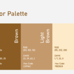
When Tracy approached me with a request to create a logo for her real estate brand, her vision was clear: she wanted something elegant, unique, and personalized, with her name integrated into a house design. She preferred a color palette of gold or brown, reflecting a sense of luxury and warmth.
Understanding that her business is rooted in real estate, I began by exploring house-inspired shapes, blending them with the initials T & L in a way that felt natural, refined, and uniquely hers. My goal was to design a logo that not only represented her profession but also captured her graceful yet confident personality. Something that would stand out while remaining elegant and timeless.
Tracy shared a wide range of logo references at first, which, while helpful, made the direction feel a bit scattered. I realized she wasn’t entirely sure what she wanted yet, so I took a step back and began sketching several hand-drawn concepts, focusing on symbolism, flow, and originality. Through multiple feedback sessions, we refined the direction, steering it away from generic references and toward something more meaningful and bespoke.
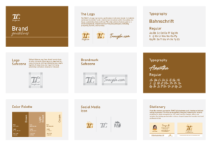
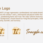
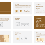
The final design features the initials T & L intertwined within a house structure, subtle, sophisticated, and full of intention. The gold tone against a soft cream or neutral background, inspired by Feng Shui principles, adds a sense of prosperity, balance, and charm.
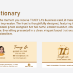
What made this project truly rewarding was seeing how much Tracy embraced the result. She loved the logo so much that she transformed her personal branding around it, changing her notebook, pen, shoes, iPad cover, even her phone wallpaper to reflect the new identity.
This project reminded me of the importance of guiding clients toward clarity, even when their initial ideas are vague. In the end, we created not just a logo, but a visual signature that Tracy proudly lives and works by.
Thank you Tracy!
